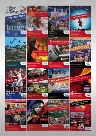
Designing a selection of posters for Sports and Welfare – A members-only club exclusively for serving and retired employees of the West Midlands Fire Service. Advertising theatre, shows and events across the UK
The poster design needs to be simple, eye-catching and informative and follow a similar theme. Choose a strong iconic image and position text around that image always makes for a cleaner design. Always build a poster using only the bare essentials and allow the text to breathe.
When designing a collection of posters try defining a grid. It will help the placement of images and text and allow for a faster workflow later on when the deadlines tight. Always design using the grid but don’t be afraid to break out should the design require it.
Use bold complementing colours and experiment with different typefaces. If the image is pleasing to the eye then use complementary colours to lift and highlight text.
